Determining impact is one of the most substantial challenges facing business owners today. Luckily, the almighty 'click' is one of the best instruments available to the marketer to measure behavior. Why? Because a click means:
- The consumer is interested
- The consumer is willing to engage with the brand.
- The consumer is ready to move from a site visitor to a warm lead.
The challenge: How do we make our visitors click? The answer is simple, a CTA.
A CTA (Call-to-actions) is a link or button that drives website visitors to sign up, to download an e-book or other actions that will move them along the buyer’s journey. According to HubSpot, a compelling CTA has two critical elements: Copy & Design To encourage your audience to click, your CTA must be click-worthy.
1) It’s all about the Action
As the name suggests, the primary objective of the CTA is to get people to act. And the action starts with you. Use verbs. Words like “Try me!” or “Claim your free trial” signal to your audience that they have to do something.
Using verbs also set expectations. When your audience clicks your CTA, they know what they’re getting into.
2) Help your Readers
CTAs traditionally connect website pages & blogs to landing pages. These are content pieces that target a specific target market with particular needs. You know that your audience is looking for. Demonstrate your value by offering help to your readers’ challenges and issues. Let them know what benefit they will get simply by clicking.
3) Grab their attention
Be creative. Push the envelope to pique your audience’s attention and interest.
- Ask a question. Not only does this capture your audience’s attention, but it also prompts the reader to answer.
- Play with your copy. When you write “Don't click me” what do you think your readers will do?
- Create a sense of urgency. Try using a countdown clock.
You can also add words like “limited offer” or “Be part of the first 10 to get a webinar pass” to encourage your audience to click now.
What about the design?
When you think of CTA design, you go beyond the button. Look at the bigger picture (literally!) Consider the background color, the background image, the typography, even the negative space.
Placement is an essential element of creating a CTA; it can take a bit of trial and error because you have to consider how your audience behaves when interacting with your content (always test). Some readers prefer not be interrupted while reading. In this case, it’s better to put your CTA on the bottom of the page.
When deciding where to place your CTA consider accessibility and convenience of your target market.
Whether you’re inviting them to try your product or to download an e-book, CTA is an opportunity to convert visitors to leads. To help you win customers, you should plan and implement your CTA efficiently Aside from making sure that the designs and copies of your CTAs are on point, avoid rooky mistakes:
- Check your spelling and grammar. Fundamental copy errors are major turn-offs.
- Always test your CTAs to know if they connect with your audience and to see how you can improve engagement.
- Make sure that your CTAs are linked to the correct landing page.
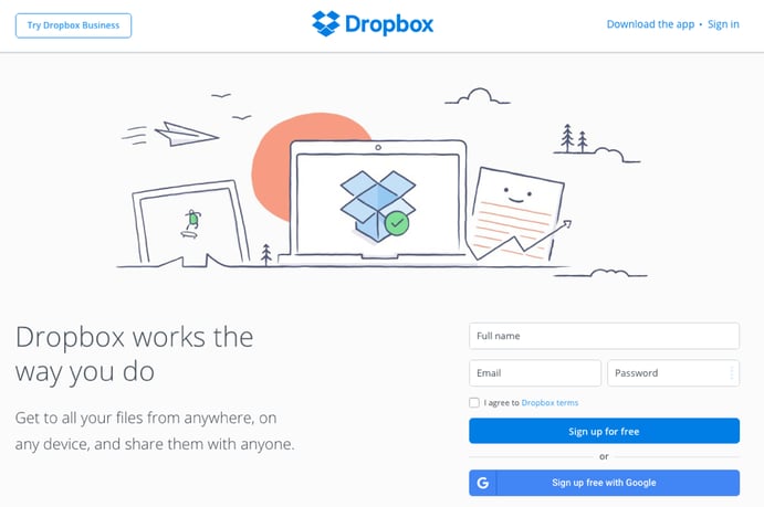
Check out one of my favorites CTAs: The cartoonish image against a white background catches your attention but doesn’t distract you. The companies logo at the center (with a green checkmark) creates a sense of awareness and familiarity. The font is simple. The entire page is seamlessly designed to direct your eyes to the CTA button in bright blue. It’s simple, creative & strategic.
Rica Bouso
Rica harnesses her love of writing to create unique and engaging content. She can reach any audience through any form of media, and she I’ll give your brand the voice you’ve been looking for.


